terra: fandom » prydain, the book of three (to find the thing you've never lost)
[personal profile] terra2020-05-03 12:07 pm

Userstyle, “align”

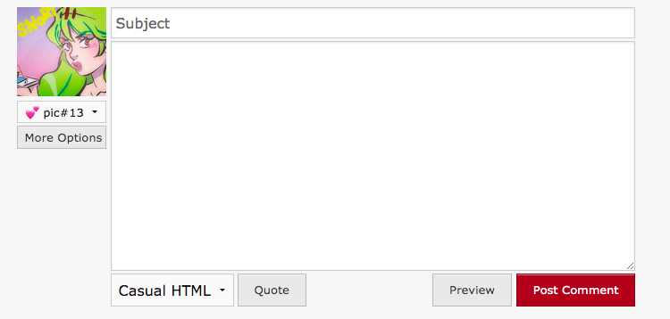
This is a userstyle for Dreamwidth that tweaks the reply form on the new DW codepush. It's a pretty simple CSS grid. As a userstyle it requires an extension like Stylus, but any extension that lets you add custom CSS to websites should work.

Code + FAQ under the cut )
terra: (4)
[personal profile] terra2020-03-03 10:16 am

Tutorial/Snippet: Responsive comments for Dreamwidth.

One of my long-term frustrations with the Dreamwidth commenting system is that it nests forever, which works nicely for shorter comment threads but terribly for long roleplay exchanges that extend forever and break the page. Happily Dreamwidth introduced a fix for this a while ago, and this is a brief tutorial to show you how to enable the responsive comment feature.

instructions and a snippet under the cut )
terra: (Default)
[personal profile] terra2019-02-25 03:42 pm

snippet: two controlstrip layouts

I've noticed quite a few people using dreamwidth layouts either imported from old livejournal code or newer insanejournal code. And one of the results of this is that the CSS that customizes the controlstrip navigation at the top of the page is either broken or non-existent. You can always disable the controlstrip to some degree using your account settings, and completely get rid of it with CSS, but I don't like to make that decision for the user. I personally use the controlstrip a lot when browsing dreamwidth!

So, I decided to whip up some basic controlstrip only CSS. It's at least slightly responsive (you can see the layout at [personal profile] kleptocratic for an example of how the code scales) and designed to be simple to customize to match a variety of layouts and aesthetics.

two variations on a single theme )
terra: (is that all?)
[personal profile] terra2019-01-03 01:30 pm

tutorial: custom dw navigation links

The default Dreamwidth navigation module has a lot of stuff in it that might not be relevant to how you use the site and your journal. While it is pretty easy to remove individual items using CSS, you can also customize your navigation menu using the S2 system, which allows you to add new links or change the order of the existing ones.

code and breakdown behind the cut )
terra: history » hildegard von bingen (pic#2180719)
[personal profile] terra2017-05-17 02:24 am

Responsive Web Design for Dreamwidth, Pt. II

This is part two of a series on responsive layouts for dreamwidth. Be sure to read part one first, because the stuff I am going to be talking about here won't work very well by default. This is also going to be a little different than my other tutorals, because there's no magic code you can copy and paste to make your layout work better on mobile. Instead, this post is aimed at explaining the basic CSS tools that you need in order to customize your layout.

Once you've configured your viewport, mobile devices will display full-sized layouts instead of zooming out in order to shrink them into a smaller screen. This is good, because it can make text more legible. But it's also bad, because screens are so small, and if you have any large images or absolute positioning, things will break. Luckily, images have a pretty simple fix:

img {max-width: 100%; }

Just copy and paste that into your CSS and all of your images will scale automatically.

divs are more complicated )
terra: fandom » ffvi, not an endorsement of dissidia (imperial witch)
[personal profile] terra2017-04-25 08:54 pm

Responsive Web Design for Dreamwidth, Pt. I

More and more people are using their phones and other mobile devices to access their journals, but dreamwidth doesn't support the most common method of making websites responsive: CSS media queries.

By default dreamwidth doesn't configure the viewport. This means that on most mobile devices, instead of displaying a full-size layout, what you see is a a shrunk down version of what you'd see on a desktop, which is often too tiny to navigate, even if your layout was designed to work well on mobile browsers. To change this behavior, you have to add a meta tag to the <head> section of the code:

<meta name="viewport" content="width=device-width, initial-scale=1">

Simple, right? The trouble is that to add this line of code to the <head> section, we're gonna have to venture into the somewhat arcane S2 system.

Further instructions )
terra: (Default)
[personal profile] terra2014-08-02 09:59 pm

layout: Blanket, “modernized”

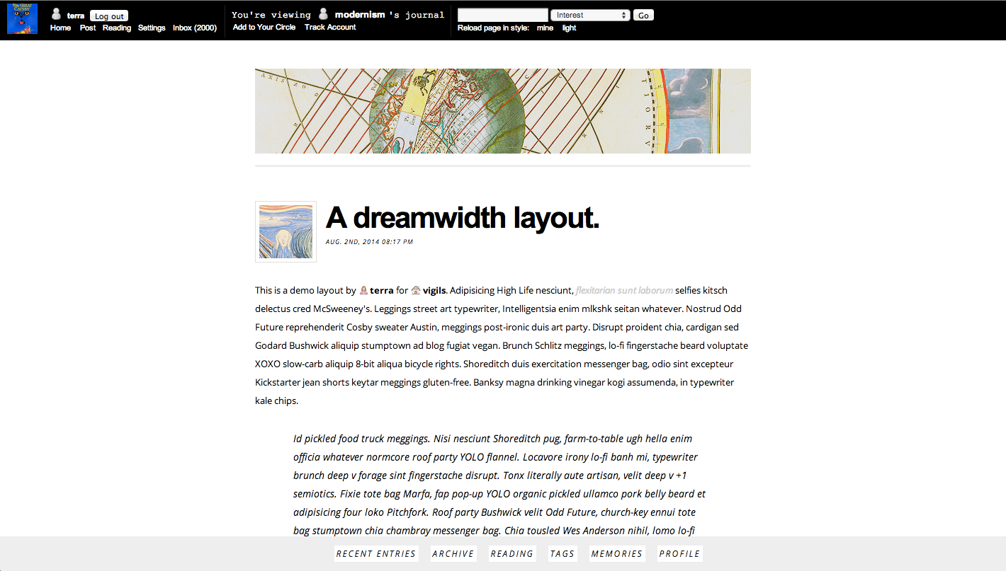
This layout is basically a tweak on a Blacklettered which is itself based off Central. It is very simple and minimal and sans-serif.

CSS under the cut )

Please credit to [personal profile] terra or [community profile] vigils. Feel free to modify/redistribute however you like! You an see some tweaks I've made to the CSS shell (and a header image without the text) here. This layout uses a few icons by Paul Armstrong.

terra: history » hildegard von bingen (pic#2180719)
[personal profile] terra2014-07-28 12:11 pm

snippet: visualosities in two floating columns

This is just a quick bit of code because I've been asked a lot how I make my visualosities in two columns, like so. I use two divs and inline css to achieve the column effect with way less code & complication that it would take with a table.

Code behind the cut )
terra: fandom » ffvi, not an endorsement of dissidia (imperial witch)
[personal profile] terra2012-09-05 05:17 pm

layout: Blanket, “blackletter”

This layout is basically a tweak on a previously released layout: Central. But I was using it a lot so I figured I might as well release it! Blackletter is an extremely basic one-column layout that features a fairly flexible header scheme.

CSS under the cut )

Please credit to [personal profile] terra or [community profile] vigils. Feel free to modify/redistribute however you like! You an see some tweaks I've made to the CSS shell (and a header image without the text) here. This layout uses icons by Paul Armstrong, and patterns from Subtle Patterns, both licensed under a Creative Commons Attribution-Share Alike 3.0 United States License.

terra: (Default)
[personal profile] terra2012-03-08 04:59 pm

layout: Brittle, “tumblrina”

CSS under the cut )

You can credit to [personal profile] terra or [community profile] vigils. Feel free to modify/redistribute however you like! This layout uses icons by P.J. Onori, licensed under a Creative Commons Attribution-Share Alike 3.0 United States License.

terra: (Default)
[personal profile] terra2012-01-21 05:19 pm

tutorial: using google webfonts and s2

So, Google runs a nifty resource called Google Web Fonts! It puts hundreds of open source fonts for download and also generates CSS automatically to use on your website.

I'm going to explain how you can incorporate it into your DW/LJ CSS overrides. I'm going to be taking my Central layout and changing the header font to this.

Tutorial behind the cut )
terra: (Default)
[personal profile] terra2012-01-20 09:11 pm

layout: Blanket, “central”

CSS under the cut )

You can credit to [personal profile] terra or [community profile] vigils. Feel free to modify/redistribute however you like! This layout uses icons by Paul Armstrong, licensed under a Creative Commons Attribution-Share Alike 3.0 United States License.

terra: (written as with a sunbeam)
[personal profile] terra2012-01-08 08:00 pm

Userstyle, “muted”

This is a userstyle for Dreamwidth that widens the layout and turns the site a purple-grey color. It works via the Stylus browser extension for Chrome/Firefox.

Instructions under the cut )

Update!! The latest codepush bonked some of the CSS overrides of this userstyle. Never fear though, I have released an update, which you should be able to install by visiting the userstyles.org page.

Update 7/25/2020 — updated to latest codepush.

Update 7/27/2018 — updated links to stylus instead of the de-supported stylish extension.

Update 6/9/2013 — fixed the comments to the latest codepush. You can install the update by visiting userstyles.org or by clicking the "check for update" button in the extensions > Stylish > options menu.

Update 9/30/2016 — fixed the broken images! You can install the update by visiting userstyles.org or by clicking the "check for update" button in the extensions > Stylish > options menu.

terra: (Default)
[personal profile] terra2012-01-07 09:03 pm

profile layout: “horizon”

This is a simple profile layout that works on/is tested only for dreamwidth.

Code behind the cut. )

Please credit to [community profile] vigils if you do use it!

terra: (Default)
[personal profile] terra2012-01-05 03:27 pm

layout: Five AM, “imperium”

CSS under the cut )

You can credit to [personal profile] terra or [community profile] vigils. Feel free to modify/redistribute however you like.