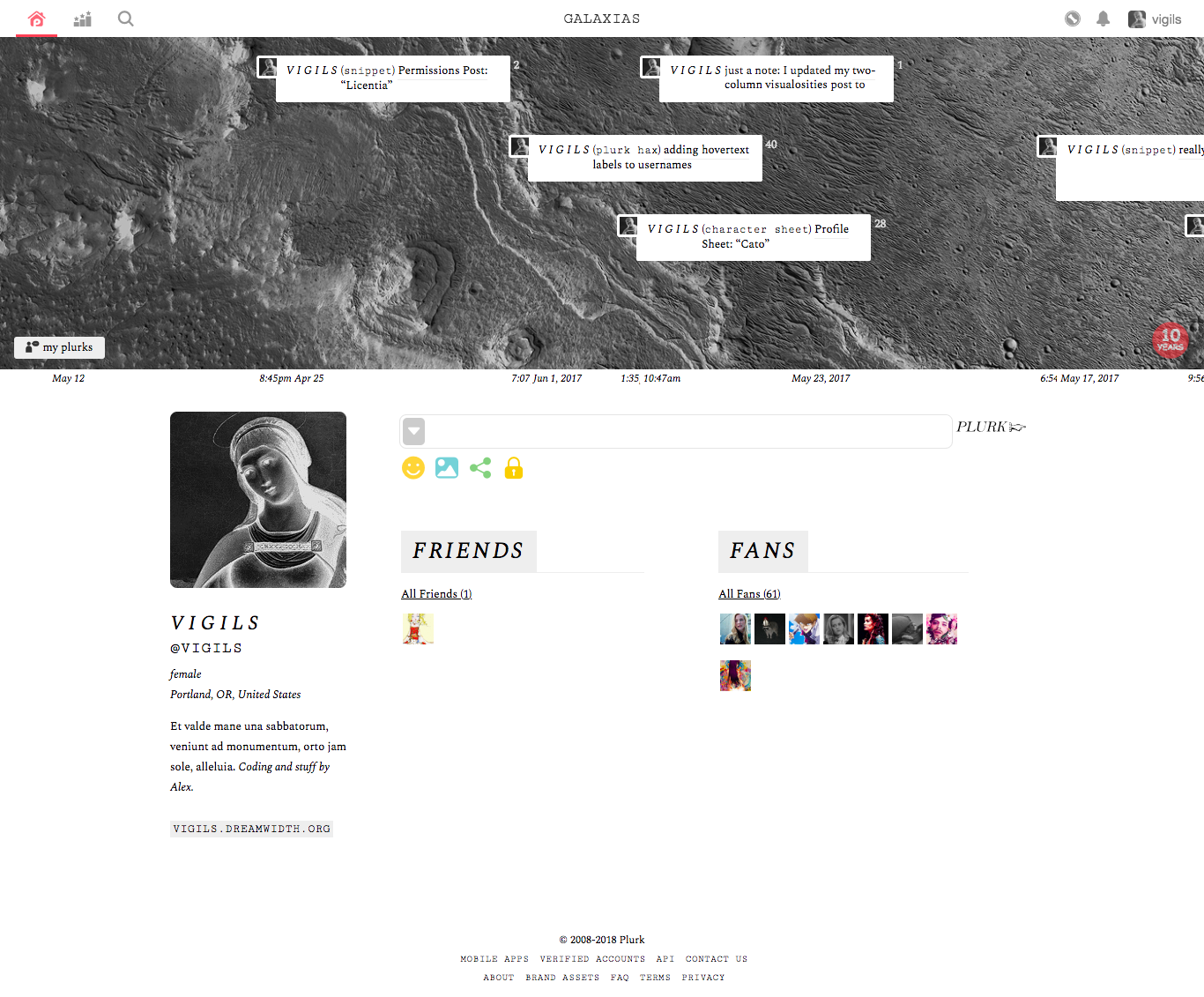
Plurk Layout: “Galaxias”
May 23rd, 2018 05:48 pm
Many years ago there were several stylesheets available for customizing plurk layouts. That all changed when plurk upgraded and broke everything. Galaxias is a layout that will work with plurk that is, instead of plurk that was.
The code
Instructions
First, to make this layout work as pictured, you need to install plurk jailbreak. This lets custom CSS apply to more things. It's optional, but recommended.
These are the plurk layout settings I used:
Customizations
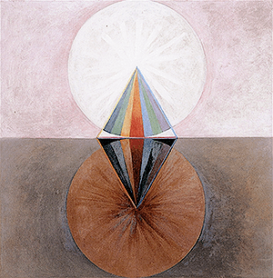
Galaxias is designed as sort of a “blank slate” layout— it's very easy to change the background image and accent color.
#timeline_holder { background:url(https://valiantknife.org/plurk/galacta.png) #444; background-size: cover; }The accent color used throughout this layout is #eee. If you'd like to change it, just find and replace.
Finally, the fonts used are Spectral and Cutive Mono, two great free typefaces. If you'd like to replace them, look for these font stacks: Spectral, Georgia, serif; & Cutive Mono, Courier New, monospace;. Be sure not to change anything in the section of the code labelled "Fonts" unless you know what you're doing.
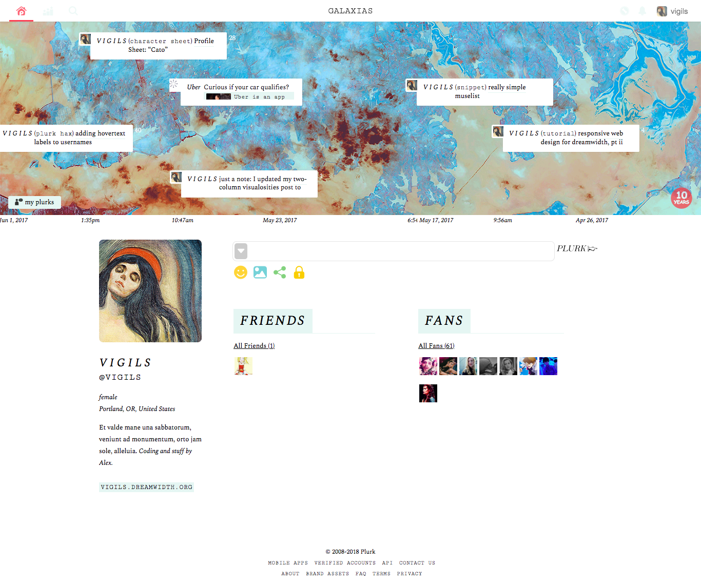
Galaxias 2

To demonstrate what the layout looks like with the images and colors slightly switched, I made a variant layout, Galaxias 2. If you like this version better, you're welcome to take that code instead:
no subject
Date: December 29th, 2018 07:01 am (UTC)and here is the altered code i've currently got (includes altered image, rounded corners, removed italics, just a heads up):
https://paste.plurk.com/show/2693311/
eta: the color change request is not because i don't love your code, it's fabulous, my eyes/head just have a difficult time with a lot of white space on the screen so i'm hoping a light grey will be less triggering <3
no subject
Date: December 29th, 2018 07:13 am (UTC)But the code to make the dashboard segments transparent is:
.segment-content {background: transparent; }
no subject
Date: December 29th, 2018 07:17 am (UTC)thank you so much!!
eta: ok, didn't work after pasting that code into the dashboard section. any idea what i should try next?
no subject
Date: December 29th, 2018 07:43 am (UTC).segment-content {background: transparent !important; }
no subject
Date: December 29th, 2018 08:12 am (UTC)i wish i could figure out a way to override the "set your plurk theme" so i could have more freedom in the color (shade of gray) i'm using but i've looked at all the plurk fix resources that i know of and none seem to address that particular mandate in the settings > layout box. that's where that #eee showed up and so i'm kind of stuck with it to make the bottom half/the entirety of the dashboard all one color. if you think of something, will you holler at me sometime? i'm at least good for now with less white, and the layout is so beautiful, thank you!
no subject
Date: February 12th, 2019 04:43 pm (UTC)I was wondering how to change the font style for the plurk usernames to something not italicized? I am using Galaxia one
Thanks! The layout is fabulous!
no subject
Date: March 25th, 2019 11:39 pm (UTC).name { font-weight: normal; text-decoration: none !important; font-style: italic; }
Just remove font-style:italic; and you're set!
no subject
Date: March 26th, 2019 12:53 am (UTC)no subject
Date: November 30th, 2022 09:03 am (UTC)